![]() Create a deeper sky
Create a deeper sky
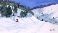
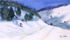
 I would also suggest making the sky deeper and richer. To do this, paint a thin layer of blue glaze in the sky area.
![]() Give the foreground more attention
Give the foreground more attention
 By making the two strokes of ski tracks on the snow darker, they will appear to be deeper. This color contrast will bring more attention to the foreground.
![]() Final touches
Final touches
 There are three areas I would suggest that could use some final attention. By giving each of these areas a thin layer of glaze, focal points are separated and more interest is added. On the mountain at the upper left, add a blue glaze, to make it recede more. Add a blue-gray glaze to make the shadow on the mountain at the right deepening the shadow. Adding a bit of yellow at the front will make the foreground more interesting.
That's it. Click here to compare the before and after paintings.
We at YongChen.com hope that you enjoyed this critique.
