![]() Observation
Observation
 Sometimes when you look at a painting, you may feel uncomfortable, and not be quite sure why that it is. The techniques are fine, the details are rendered well. So what is it? What could be laying inside of these obvious things? This is what is called: design elements in a painting.
Here are what I consider to be the issues for this watercolor landscape painting:
![]() Breaking the hard lines
Breaking the hard lines
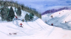
 If you look closely at this painting, you can't avoid noticing that there is a big "X" in the middle of the design. It is too hard, as it drives your attention to the area where these two lines intersect. This element needs to be a secondary element.
 My first suggestion for improvement: break the “X” and push the background back, by moving the line of the mountain on the right higher. This change makes the painting more relaxing.
![]() Extend the vertical space and move signature
Extend the vertical space and move signature
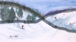
 To make the painting more relaxing, I'd create the illusion of more room at the bottom of the painting. To accomplish this simply move the signature from the left of painting, to the right side in this painting.