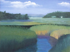
How to make an oil landscape painting more interesting
Original painting by Kenrick Tsang, Suggestions by Yong Chen
![]() Observation
Observation
 Kenrick is a hard working, talented young artist. When I received
this image, I said, this is a very nice painting, from someone who is only 13 years old.
I would like to give my thoughts for possible improvements. Here are what I consider to be the issues for this oil landscape painting:
- There is not enough depth of space between foreground and the background.
- There is no focal point.
- There is a lack of motion within the painting.
This is how I would modify this painting:
![]() Push back the background
Push back the background
 One of the techniques to create more space is to lighten up the colors of the objects in the background, so they are closer to the sky's color and value. In addition, I would tone down the details and contrast in the background, making this area appear to recede even farther.
